Picture this: You’re knee-deep in a brutal boss fight in Baldur’s Gate 3, but your backpack’s a total mess. You scramble for that healing potion, sift through endless loot, and boom, game over because you can’t find it fast enough.
Complex RPGs like Path of Exile make it worse. You spend ages sorting stacks of gear, miss crucial items, and lose your flow. Frustration kills the immersion you crave.
Good news: A simple intuitive inventory system for RPGs fixes this. It organizes your complex RPG inventory so you make quick calls, stay in the action, and enjoy smoother play.
Ready to build one that speeds up decisions and amps up fun? Let’s start with the basics.
Categorize Items Smartly to End the Endless Scrolling
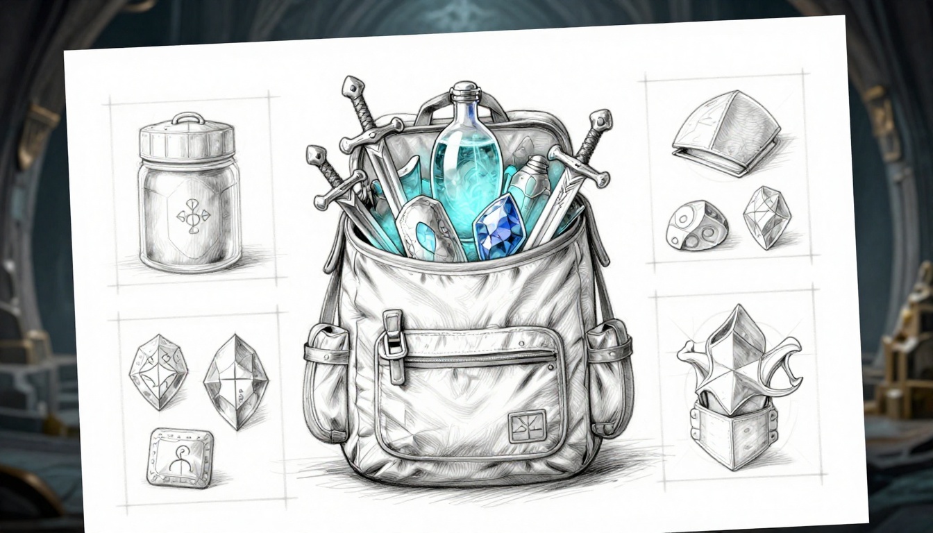
Poor categorization turns your RPG inventory into a nightmare. Imagine hundreds of items crammed together in complex games like Elden Ring or Diablo 4. You scroll forever for that one rune or affix-heavy piece of gear. Frustration builds because everything blends into clutter. Players waste time digging instead of playing. Smart categorization fixes this fast. It groups items by type, use, and rarity so you grab what you need without hassle. Start with a full audit, then build logical groups. Your players will thank you with smoother sessions.
Spot Every Item Type and Its Real-World Role
First, audit every item in your game. List them all in a spreadsheet. Tag each by type, role, and rarity. This uncovers bloat you never noticed. For example, Skyrim overflows with clutter like books, junk, and keys that fill space but serve little purpose. In contrast, Final Fantasy keeps things tight with clear roles for each potion or spell scroll.
Why bother? Because hidden junk slows everyone down. Use this simple checklist to sort:
- Does it stack? (Potions yes, unique swords no.)
- Is it equippable? (Armor and weapons head here.)
- Quest-locked? (Mark these to avoid accidental sales.)
Take Elden Ring runes and ashes of war. Runes upgrade stats, so tag them as progression tools. Ashes boost combat skills, rare finds for builds. Diablo 4 gear shines with affixes; common drops get basic tags, legendaries get special handling. As a result, you spot overlaps early. No more endless lists of “misc” items.
Here’s a quick table to map your audit:
| Item Type | Role | Rarity Example | Real-World Use |
|---|---|---|---|
| Weapons | Offense | Common dagger | Direct combat |
| Consumables | Utility | Epic potion | Quick health boost |
| Quest Items | Progression | Unique key | Story advancement |
| Crafting Mats | Building | Legendary ore | Gear upgrades |
This setup reveals bloat right away. Cut the fat, and your inventory breathes easier.
Group Like a Pro: Logical Buckets Players Love
Next, group items into buckets players grasp instantly. Start with 5-8 top-level tabs: Gear, Consumables, Materials, Quest, Keys/Junk, Storage, and Utilities. Under Gear, add sub-groups like Melee Weapons or Ranged. World of Warcraft nails this with tabbed bags; you switch fast without nested mess.
Function-based grouping works best. Offense items stay together: swords, spells, buffs. Defense gets armor and shields. Context matters too. Active-use gear sits upfront; long-term storage goes last. Avoid too many categories, though. Over ten confuses newbies and vets alike.
Players love this because panic moments get simple. Need potions mid-fight? One tab away, no digging. Here’s how to build it step by step:
- Pick primary tabs based on core loops (combat, crafting).
- Nest subs only two levels deep.
- Test with players: Can they find a bomb in under five seconds?
In short, predictable groups match player psychology. Veterans scan intuitively; rookies learn quick. Your inventory stops endless scrolling cold.
Customize for Your RPG’s Flavor and Flow
Tailor groups to your game’s vibe. Magic-heavy RPGs need a Spell Components tab separate from potions. Survival titles sort resources by biome: forest herbs, desert stones. This keeps things relevant as players explore.
Link it to progression too. Early game stays simple with three tabs. Late-game adds filters for rarity or level. Picture a cyberpunk RPG: Hacks and Tools get their own spot next to cyberware implants. Gear for street fights differs from corp espionage gadgets.
Scale with complexity. Start broad, refine as loot piles up. For instance, Path of Exile thrives on deep builds, so group by socket colors or mod types. Players adapt without frustration.
Most importantly, test in playthroughs. Does the system flow with your story beats? Adjust until it does. Your intuitive inventory now matches the adventure perfectly.
Craft a Layout That Lets Players Fly Through Choices
You sorted your items into smart categories. Now make them easy to see and grab. Bad layouts bury loot under clutter. Tiny icons force squints; cramped slots slow every tap. Good ones let players zip through choices. They spot gear fast and stay in the fight. Think Borderlands backpack: roomy grids with color pops make upgrades jump out. Your layout turns chaos into speed.
Fixed pages beat infinite scroll every time. Scroll traps players in endless hunting. Pages load quick and show limits. You control the view, so players focus. Add thumb-friendly designs for controllers or mobile. Big zones cut mis-taps. As a result, clicks drop by half. Players win more battles because they act faster.
Tabs or Grids: Choose Views That Fit Any Screen
Tabs shine for quick category switches. Players jump between weapons and potions in one tap. Grids excel at visual scans. Rows of icons let eyes roam free for the best loot. Hybrids rule: tabs hold categories, grids fill the space inside. Dragon Age: Inquisition does this on consoles. You flip tabs for armor or herbs, then grid-scan inside. No overflow swamps the screen.
Test overflow hard. Full inventories need smart handling. Hide extras behind “show more” or auto-page. Bad layouts cram 100 items into view; good ones cap at 40-50. A 4×10 grid fits most phones. Scale icons to fill slots without stretch. Color-code rims by category: blue for magic, red for fire damage.
Infinite scroll fails in RPGs. It hides gems deep down. Fixed tabs keep everything upfront. No Man’s Sky upgrades prove it. Their grid pages with tab filters make vast inventories tame. Players browse without frustration.
Picture a sketch: top bar with five tabs (Gear, Consumables, etc.). Below, a 5×8 grid. Icons snap to edges. Overflow arrows page left-right. Thumb zones stay at screen bottom. This setup works on PC, console, or touch.
Compare options side by side:
| Layout Type | Best For | Drawback Fix | Example Game |
|---|---|---|---|
| Tabs | Fast category hop | Add grid sub-view | Dragon Age |
| Grids | Visual browsing | Cap rows, add pages | Borderlands |
| Hybrid | All screens | Responsive scaling | No Man’s Sky |
Hybrids win because they adapt. Test on devices early. Players love layouts that fit their playstyle.
Optimize Slots, Icons, and Space for Speed Demons
Big icons rule. Aim for 64×64 pixels minimum. Fingers hit them clean on touchscreens. Keep sizes consistent so eyes don’t hunt. Empty space around each slot lets it breathe. No overlaps, no squeezes.
Color rims signal rarity fast. Gold outlines scream legendaries; gray means junk. Players spot upgrades in a blink. Drag-and-drop speeds swaps. Grab a sword, drop it on your character sheet. Done.
Cramped slots kill flow. Wide gaps prevent fat-finger errors. Thumb-friendly means 20% margin per icon. On controllers, bump to 80×80 pixels. Borderlands nails this: slots glow on hover, space invites drags.
You gain instant reads. A blue-rimmed epic bow stands out against common greens. Players equip better gear without pause. In short, optimized space turns browsers into speed demons.
Add Search Bars and Filters from Day One
Search bars save lives in bloated bags. Fuzzy matching finds “sword fire” even if you type “fiery blade.” Dropdown filters narrow it: level 50+, fire damage only. Auto-complete pops suggestions as you type. No more “where’s that potion?”
Steam inventory shows how. Type “knife,” filter by rarity, sort by value. Results load in seconds. RPGs need this from launch. Early clutter hits new players hard.
Place the bar top-center, always visible. Filters sit next to it: dropdowns for type, slider for level. Real-time updates keep lists tight. Players type once, grab instantly.
Benefits stack up. Filters cut lists by 80%. Fuzzy search catches typos. You end those panic scrolls mid-boss. Add sort options too: by power, acquisition date. Players customize their flow.
Start simple. One bar, three filters. Expand later. Test with full bags: can you find a rare drop in three seconds? If yes, your system flies.
Layer on Features That Make Management Invisible
You’ve got categories and layouts in place. Now add smart inventory features for RPGs that handle the grunt work behind the scenes. Players barely notice because these tools run quietly. They sort, stack, and clean up so you focus on the story or next boss. As a result, sessions last longer. Frustrated players quit early; smooth ones stick around for hours. Keep it simple to avoid UI overload. Start with auto-features, then quick interactions, and end with limit handlers.
Auto-Sort, Stack, and Salvage for Zero Effort
Auto-sort keeps your bags tidy without a single click. Set it to arrange by newest items first, then quality or value. Identical potions stack automatically into neat piles. One-click junk marks trash for salvage. Toggle these on or off in settings so players choose their style.
Destiny 2 shows this perfectly with its dismantle button. Highlight gear, hit one key, and it breaks down into glimmer. No menus, no hassle. Similarly, Path of Exile stash tabs auto-group by type or mod. You drop loot, and it files itself. Players free their brains for combat builds or quests.
Benefits pile up fast. Stacks cut clutter by half right away. Sorting by value highlights upgrades instantly. Salvage clears junk before it overwhelms. In short, you play more and manage less.
Turn it on by default for newbies. Vets can tweak rules like “sort weapons by damage.” Test during full runs. Does loot vanish into order? Good. Players forget the system exists because it just works.
Favorites, Tooltips, and One-Tap Actions
Mark your best gear with a star for favorites. It pins them to a quick-access row at the top. Hover over any item, and tooltips pop full stats, damage comparisons, and build fits. Right-click for one-tap equip, sell, or craft.
This slashes menu dives. Path of Exile feels like it has an in-game wiki; hover a unique, see every mod and price. Warframe void relics work the same: quick stats on hover, favorites for your meta loadout. No digging through tabs.
Players love it because decisions speed up. Spot a better sword? Right-click equip, done. Tooltip compares DPS side-by-side. Favorites ensure your meta helm stays handy mid-run.
Add filters to favorites too, like “show only level 50+.” Place the star icon next to each slot. Tooltips fade after two seconds to keep screens clean. As a result, you reduce clicks by 70%. Retention climbs when gear swaps feel instant.
Manage Limits Like Weight and Durability Smoothly
Visual meters track encumbrance and durability without nagging. A color-coded bar fills as weight nears max: green safe, yellow warning, red overload. It warns before you equip that heavy plate. Repair queues line up broken gear for one-tap fixes.
Kingdom Come: Deliverance blends realism smooth. Your armor degrades in rain, but a simple queue mends it overnight. No constant checks. Meters sit in the corner, glanceable.
Integrate it gently. Over-encumbrance slows speed by 10% with a subtle icon blink. Durability drops show as cracks on icons. Auto-queue repairs when you rest at camp. Players feel the weight without pain.
Why it works? Realism adds depth, but automation prevents tedium. Tie queues to crafting stations for bonuses. Test with heavy loads: does the meter guide without stopping play? Perfect. Your system stays invisible, yet keeps worlds believable.
Connect Inventory to Your Game World and Polish It Live
Your categories, layouts, and smart features work great alone. Now link them to the game world for smooth RPG inventory integration. Loot drops straight into slots. Quest items jump to the top. Crafting pulls mats without menus. Players stay immersed because inventory feeds every loop: combat, quests, building. As a result, they grab potions mid-fight or craft upgrades on the fly. Polish comes next through tests and tweaks. Build prototypes early, then iterate fast. Games like God of War Ragnarok nail this; its inventory ties gear to skill trees and boss loot without breaking pace.
Weave in Crafting, Quests, and Combat Loops
Auto-features tie inventory to action. Loot deposits direct into right tabs. A slain goblin drops herbs into Materials, no pause. Quest items auto-move to a top Quest slot. You spot the glowing key right away. Meanwhile, craft-from-inventory opens a quick panel. Drag mats to recipes; gear assembles in seconds.
This boosts the core loop. Players loot fast, organize on auto, and use items without friction. Combat flows better because potions sit ready. Quests advance smoothly since keys never bury. Crafting stations stay optional; inventory handles basics.
Consider these ties:
- Direct loot: Enemies drop into Consumables or Gear tabs by type.
- Quest priority: Special glow and pin for story bits.
- Craft preview: Hover mats to see output stats.
God of War Ragnarok shows it perfect. Axe upgrades pull from inventory mats during rests. No extra screens. Players feel powerful because inventory powers progress. Test these links in short prototypes. Does loot excite or annoy? Adjust until it pulls players deeper.
Playtest Ruthlessly to Uncover Hidden Frustrations
Grab 10 testers early. Pick diverse folks: newbies, vets, controller users, mouse players. Give them full bags and tasks like “find the fire sword, equip it.” Track time-to-task. Aim under 10 seconds per item. Heatmaps reveal click storms on bad spots.
Ask pointed questions after. “Did it feel intuitive?” “What slowed you?” Note top pains: maybe search misses fuzzy names, or tabs confuse. Fix the three biggest first. For example, if heatmaps show grid hovers, widen slots.
Run sessions weekly. Prototype v1 with basic links, watch fails. Testers spot issues you miss. One found quest items hid under junk; auto-top fixed it. As a result, flow improves 30%. Keep logs simple: time stamps, quotes, fixes.
Short bursts work best. 20-minute tests yield gold. Reward testers with credits. Their pain points make your system shine.
Refine with Data and Feedback for Lasting Shine
Metrics guide the final push. Watch abandonment rates at inventory opens; drop them under 5%. Track session length after changes. Longer plays mean wins. A/B test v1 basic against v2 with full integration. V2 wins if players craft 20% more.
Community polls build buy-in. Post prototypes on Discord: “Tabs or grids for loot?” Use votes to tweak. Iterate quick: week one basic sort, week two quest auto-move.
Data shows truth. One poll favored direct deposit; abandonment fell. Session times jumped 15 minutes. Tie feedback to metrics. Testers hate slow loot? Speed it up.
In short, prototypes early, test often. Your inventory now lives in the world. Players craft, quest, fight without thinking. Ready to launch a system they love? Next, scale it for endgame hordes.
Conclusion
Smart categorization stops endless scrolling.
Fast layouts let players grab items in seconds.
Quiet features handle the busywork.
Tight integration and tough tests make it all shine in your game world.
Your intuitive inventory system for complex RPGs flips the script.
That boss-fight scramble in Baldur’s Gate 3? Gone.
Clutter turns into quick wins. Players stay deep in the action because management feels like joy, not a chore.
Pick one step today.
Audit your items or add a search bar this week.
Share your tweaks and results in the comments. We all learn from real tests.
What change hits your game hardest?
Test it now.
Watch players rave about your RPG’s silky inventory.