Picture this. You’re creeping through the dark corridors of Dead Space. A necromorph lunges from the shadows. Your health doesn’t flash as a red bar on screen. Instead, glowing holograms flicker from Isaac’s suit, cracking as damage mounts. Panic hits harder because the UI feels real, part of the nightmare.
Diegetic UI changes everything. It places interface elements inside the game world, like holograms from a wrist device or screens etched on walls. Forget floating HUDs that pull you out. This approach keeps you locked in.
Players engage deeper. Worlds feel alive. Games stand out in a crowded market. In this post, you’ll grasp the fundamentals, master key principles, follow a step-by-step guide, study real examples, and dodge common pitfalls. You’ll get simple steps any designer can apply today to boost immersion.
Why Diegetic UI Beats Traditional Floating HUDs Every Time
Traditional HUDs hover like ghosts over your screen. They show health bars, ammo counts, and minimaps without tying to the world. Diegetic UI shifts that. It uses in-game objects, such as a character’s visor or a cockpit dashboard.
This switch delivers big wins. Immersion skyrockets because nothing breaks the fourth wall. Storytelling flows through the UI itself. Players interact realistically. Focus sharpens without distractions.
Consider movies. Subtitles float annoyingly sometimes. Words carved on a stone wall? They belong. Diegetic UI works the same way. It pulls you in fully.
Yet HUDs have their place in fast-paced arcade titles. Diegetic shines brightest in horror, sci-fi, or narrative-driven games. There, it builds tension naturally.
The Magic of Making UI Part of Your Story
Diegetic UI tells tales without words. A cracked helmet display signals injury. It hints at lore through faded logs on a terminal.
Take damaged gear. Cracks spread as health drops. Players feel the wear. Tension builds because the story lives in every glance.
Or think of logs. They appear on in-world devices, not pop-ups. Lore unfolds organically. Players uncover secrets at their pace.
This method connects emotionally. You care more about the character. The world reacts to your choices. Results? Deeper investment.
Boost Player Focus Without Clutter
Busy HUDs overload screens in shooters. Icons stack up. Players split attention.
Diegetic UI clears that mess. Info lives in the environment. Check a wrist scanner briefly. Glance at a suit readout.
You stay present. No constant scanning. Eyes lock on action.
In contrast, cluttered HUDs pull focus. Diegetic keeps the moment pure. Players react faster. Flow improves.
Core Principles to Nail Diegetic UI Design
Strong diegetic UI follows clear rules. Blend it with the environment first. Ensure readability next. Make interactions natural. Balance info loads. Optimize performance always.
These principles boost immersion. Test them early in sketches. Players notice when it fits right.
Start simple. Compare readability to road signs at night. They glow clear. Your UI must too.
Seamlessly Blend UI into Your Game World
Match materials and lighting. A rusty post-apoc screen shows grit. Holograms in space gleam crisp.
Physics help. UI sways with movement. Dust settles on displays. It feels native.
Lighting reacts dynamically. Shadows shift. Glows pierce fog. Players buy the realism.
Test in-engine early. Does it pop wrong? Adjust shaders. Blend wins trust.
Keep Text and Icons Crystal Clear Always
Fonts matter. Choose bold, sans-serif styles. Scale size with distance. Close up? Details sharpen.
Colors contrast backgrounds. White on dark works. Invert for bright scenes.
Icons simplify. Universal shapes beat text. Add audio beeps as backups.
Players read fast. No squinting. Immersion holds.
Design Interactions That Feel Real and Fun
Gestures fit characters. Swipe a visor. Tap a holographic button.
Buttons sit on props. Press a dashboard key. Voice commands suit sci-fi heroes.
Avoid frustration. Make hits generous. Feedback vibrates or glows.
Fun interactions reward. Players smile at clever touches.
Your Step-by-Step Guide to Building Diegetic UI
Build diegetic UI in five steps. Study your world first. Brainstorm spots. Sketch mocks. Prototype. Polish with tests.
Indies finish fast. Each step takes days, not weeks. Tools like Figma speed it.
Follow along. Apply to your project now.
Brainstorm Spots Where UI Fits Naturally
Hunt natural homes. Visors for first-person views. Tablets in inventory scenes. Mirrors reflect stats.
Environments offer screens. Cockpits show maps. Walls hold logs.
Tie to lore. Soldiers check rifles. Explorers scan devices.
List ten ideas per character. Pick three winners.
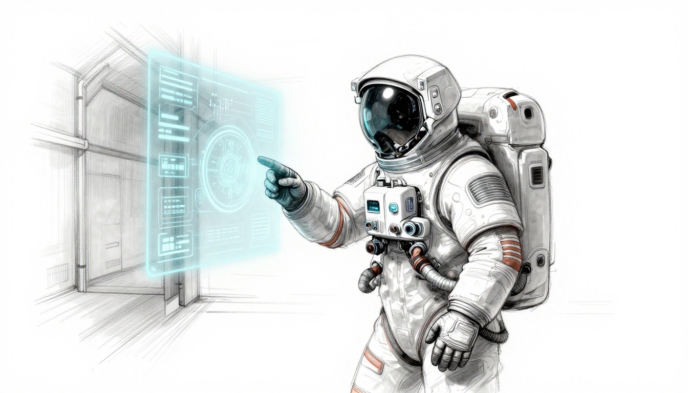
Prototype Fast to Test Immersion Early
Sketch on paper first. Then Figma for mocks. Import to Unity.
Playtest read speed. Time glances during action.
Free tools shine. Blender for 3D. Godot prototypes quick.
Iterate weekly. Fix blur or lag. Immersion sticks.
This sketch captures prototyping a suit hologram. Notice how damage cracks the projection.
Game-Changing Examples That Inspire Diegetic Mastery
Great games nail diegetic UI. Dead Space leads with suit holograms. Alien: Isolation uses a motion tracker. Control bends screens with chaos. The Last of Us Part II weaves notes into props.
They succeed because UI serves story and play. Takeaways apply anywhere.
Study these. Steal smart ideas.
Dead Space: Holograms That Scare and Inform
Suit orbs pulse health and stamina. Damage cracks them. They flicker low.
Animations sell fear. Orbs shrink as you hurt. Restore them tense.
No HUD distraction. All eyes on threats. Horror intensifies.
Designers note: Tie UI to vulnerability.
Control: UI That Warps with the Chaos
Monitors shift shapes. Abilities project from hands.
World bends. UI follows. Papers float as menus.
It matches reality shifts. Players feel power.
Key lesson: Let physics rule UI.
The sketch shows Control’s dynamic screens. Chaos integrates perfectly.
Steer Clear of These Diegetic UI Traps
Pitfalls kill diegetic UI. Dark areas hide info. Overload confuses. Accidental breaks pop HUDs.
Performance dips from effects. Accessibility ignores colorblind players.
Fixes exist. Dynamic lights boost visibility. Minimalist designs cut clutter.
Add options menus outside. Test wide.
Checklist: Visibility check. Info balance. Playtest access. Perf stats green? Ship it.
Pull Players Deeper with Diegetic UI Today
Diegetic UI transforms games. It immerses fully. Stories stick. Focus sharpens.
You’ve got the principles, steps, examples, and traps to avoid. Start small. Add one wrist scanner to your prototype.
Try it now. Share your designs in comments. What game inspires you most?
VR and AR demand this style soon. Get ahead. Your worlds will breathe life.